


- Adults
- 60 min
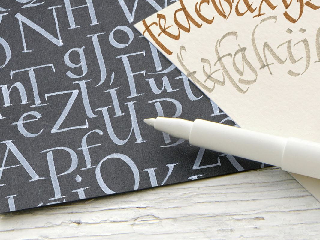
What you need:
Pitt Artist Pens, Pitt Artist Calligraphy
The Simple Brush Alphabet
In calligraphy with the brush nib, the width of the line can be varied. In this alphabet, the x-height letters are half as high as the ascender and descender. The capital letters are 1.5 times the size of the x-height letters. The Faber-Castell Pitt Artist Pen Brush (B) is a versatile and fl exible tool which can be used in many different ways. It is available in 60 different colours. Varying the writing pressure changes the width of the line from very thin to thick. Apply pressure on the downward strokes and release the pressure on the upward strokes. Calligraphy with a brush nib is a lot of fun, but needs some practice. Because of that, it is advisable to draw some lines with more and less pressure before starting to exercise using the alphabet.

| Characteristics of the Simple Brush Alphabet | |
| x-Height | x |
| Ascender | 2x |
| Descender | 2x |
| Capital letters | 1.5x |
| Slant | 15° |


The Simple Roman Alphabet
This script achieved fame at the beginning of the 20th century through the so-called “father of modern calligraphy“, Edward Johnson, and is based on the 10th century Carolingian minuscule style. Many beginners start with the simple Roman capital letters in order to obtain a feeling for the classical proportions.
Capital letters
To achieve an even downstroke, increase the pen angle to 45º when making the diagonal strokes of the letters V, W and X. Decrease the pen angle to 20º when making the diagonal strokes of the letters K, Q, R and Z.
Lower case letters
The lower case Roman letters are based on circles and straight, vertical lines. Similarly to the capital letters you should increase the angle to 45º in order to avoid excessively strong
lines for the letters v, w, x and y. For the letter z, the angle should be flattened to 20º

| Characteristics of the Simple Roman Alphabet | |
| x-Height | 5 nib widths |
| Ascender | 2 nib widths |
| Descender | 3 nib widths |
| Capital letters | 7 nib widths |
| Pen angle | 25º for most capital letters/ 30º for lower case letters |
| Slant | None |


The Simple Italic Alphabet
This graceful, fl owing hand is one of the most popular and versatile styles of calligraphy. It is often used to address invitations and design greeting cards. Dating back to the 15th century Italian Renaissance, it features an elliptical “o”, asymmetrical arches and a gentle slant.

| Characteristics of the Simple Italic Alphabet | |
| x-Height | 5 nib widths |
| Ascender | 2 nib widths |
| Descender | 3 nib widths |
| Capital letters | 7 nib widths |
| Pen angle | 35º for lower case letters |
| Slant | 7° |

